

Our new View Layout Builder, which was introduced in Polonious version 20.1 got additional capabilities with the recent 20.2 release, which we are introducing in this blog post.
The embedded video showcases how to configure a couple of widgets in the new view layout builder. This is an introduction to the ‘What You See Is What You Get’ configuration functionality being rolled out wherever possible across the system.
We have a number of very cool widgets available which we explain in a full instructional video we have available on request. However, for now we want to demonstrate the process of configuration with two basic widgets.
An important note on the new case view builder is that you can create a different view per case type. So you can e.g. show more photos on a surveillance case, fewer photos but more data on a factual or forensic case, and so on.
We believe your team can take on the task of building their own case views into a powerful, at-a-glance summary of the information most relevant to any particular case type.
So how does this help your team?
- Easier configuration of case views – drag and drop widgets.
- More flexible case views – move any info, anwhere.
- More specific case views – more relevant info on cases.
So, what did we just see?
In an 8 minute video we added the main case data. In real life, you’ll do more building but less talking, so it’s very quick to build a whole view.
Different widgets have slightly different configuration, but it all follows roughly the same process. The more detailed widgets add more complexity, but it is still very easy.
We believe you can do this task now with no IT involvement required. This is a big saving in doing time, turnaround time and internal costs.
So what did we just see in terms of Polonious case view configuration?
You can easily select the case data you need to display for any particular case type.
It’s easy to lay it out in a neat, informative way that looks good in the new Polonious view.
You got a glimpse of the array of widgets available – please get in touch if you’d like to know more.
What else can we do with this new capability? What are the other possibilities?
With this new approach, and with the underlying functionality built out, it’s easier to add new widgets to further improve what you can do with the new case view.
We’ve also made it easier to upload new CSS to change the underlying look and feel in terms of background colours, logos, etc.
We hope you enjoy our new 20.2 release. We really look forward to seeing what your team are able to put together with this new capability.
If you have any questions or improvement suggestions, we are very keen to hear from you. Thank you.
Transcript
Hello it’s Nicholas from Polonious here with a quick introductory video to our new case layout feature. So this feature allows you to move everything around the page and lay it out whatever way you want, and it’s a new ‘what you see is what you get’ drag and drop tool that will allows you to completely change the layout of the case. We do have an instructional video on that coming but it is a 30-45 minute long video so not really good for an introduction. It has all of the details on how to set it up so if you’d like that, please get in touch with us, but for now we’re just going to give you a quick introduction.
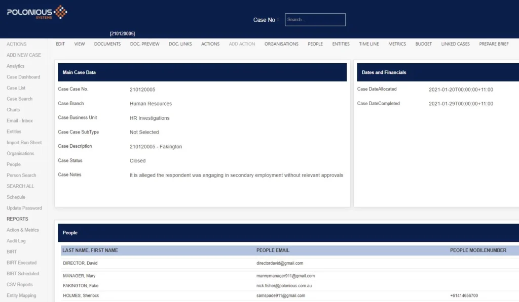
So here, as you can see, is the old case view if you’re familiar with it, so on this there’s a lot of things that are fixed, it’s not movable and so what we’re going to do is just take some of this information here so you know what we should be seeing and then go just configure a couple of what we call widgets on the new case view. We won’t put all of this information on here just enough to show you how it works and then if you would like to get a breakdown of more of the widgets or things like that, or how you can replicate this case view then please get in touch with us for the instructional video.
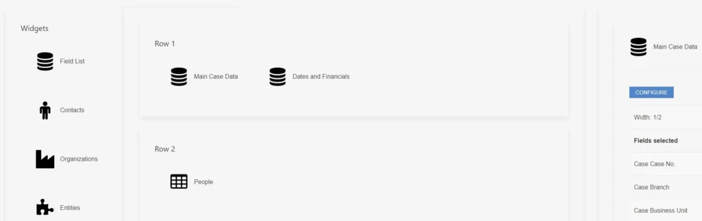
So the first thing I’m going to do is enable a case view here so we’re going to make it the layout view, which is the new view, and we don’t have anything in here yet. I’ve selected this one so if we refresh this case it should go to the new view now, but there’s nothing on here because we haven’t set anything up, but you can see what was supposed to be on there before. So just to give you an example of this we’re just going to drag across say two field lists that kind of replicate that data that was at the stop at the top of the case and then just a table with a little bit of data in that.
So what we’ll do here is on this field list we’re going to grab some basic case data like the case number, a couple of organization levels, maybe a description, notes and a status and that should do us in this one for now. We’re going to select that we want the labels on the left, so this is just the names of each field that will be next to the values that tell you what it is. We’ll grab the details now, they can be left as they are and they will display like this or you can change them – so most of this is okay except this one doesn’t look particularly user friendly so we will just call that case status – and here you can change the number of rows, font size, formatting to make the labels look different, this is just the labels for now, and then we can also name the whole field. So this is to make sense of it in this view you can just name it as that and leave it with no heading or you can give it a heading and actually make it surface on the case view as well. Then you can justify that heading similar to what you can do with the details here, and then lastly we’re going to give it a size.
So everything in the new view the sizes are in fractions and that’s because the new view is responsive as well, so we don’t want to say it’s x number of pixels because then if you move between a big screen and a small screen and a mobile device it’s going to end up looking really strange with a lot of blank space or spilling over and having to scroll. So here you just set it out in rows that represent you know a kind of a full screen width or a couple of screens in length and then you set out a fraction so they space themselves according to the size of the screen, and if you’re on something really small like a mobile they’ll line up and down so that you can scroll through and it works better on a mobile. So for here we’re only doing two widgets on this line so we’ll make it a half. We’ll grab this one and just call it dates and financials and we’ll just grab a couple of dates here, allocated and completed is good enough for an example, labels on the left again, details we’ll leave as they are, and we’ll call this dates and financials and give it a heading, make it half again. So that’s your basic field list widget that lets you pick data and just basically display the data as is with the label on the left and the value on the right.
Underneath that we’re going to show you a table which is useful for surfacing things like people, entities, and assets. We’ve got specific widgets for those as well where they will display a card with more detail on it, but this is a useful view for summarizing people attached to a case and things like that. So it depends on how you want to view that information as to whether you use this or the specific widget. So we’re going to drag a couple of details across here, this is a new thing where you can combine the last and first name – they’re separate fields in the database but we can join them and we’ll just call it last name-first name – and that’s just handy for display here. We’ll call this people and give it a heading and then the size, we’ve got one on that row so we’ll just make it a full width.
So then we have a number of other widgets under here which I won’t go into now, but I do explain more in the full video that we’ve got, and so we’ve got a number of graphs that you can show on the case, you know useful things like radar charts good for QA, time series is good for budgets and things like that we’ve got a media viewer so for example if you’ve got a surveillance case you may want to surface photos or an accident case you may want to surface accident photos, cctv, things like that so you can surface that on the front of the case now rather than needing to go into doc preview, but for now that’s enough for our little intro.
So we will click away here and go back to this view and just refresh and you can see this data’s come up now, we’ve got half width for these here and we’ve got a table there and then we can go you can see that it’s pretty much what you see is what you get so we’ve laid it out like this and we’ve got a full width to half widths we can also move things around and so you can see that it’s a very easy drag and drop repositioning through some of those details that I showed you before. You can also change things like font size font color, things like that.
It’s very easy to reposition everything around here and it allows you to put anything where you want it, so it is a lot more powerful than the old case view and it’s a lot more configurable. The other important feature of this is that you can set a different one per case type so for example if you’re a private investigation firm and you have some factual cases and some surveillance cases you may want to put those photographs on a surveillance case but they might not be as important on a factual. So you don’t have to surface those on a factual, you can have more of those data fields where you fill out information that you found. So as I said, we have a longer video available if you want to know how to do this, for now it’s just telling you that it exists and that it’s pretty cool so I hope you like it and please get in touch – thanks.
Let's Get Started
Interested in learning more about how Polonious can help?
Get a free consultation or demo with one of our experts